THE CHARTS THAT
TELL THE STORY. THE HISTORY SHOWS THE TRUTH. WHAT REALLY
HAPPENED:
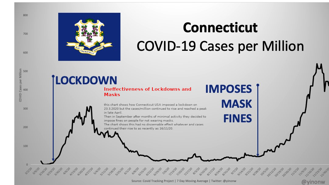
CONNECTICUT:
Chart clearly showing lockdowns imposed in March did precisely nothing
to prevent a peak rising nor change its path and a mask mandate
imposed in September did nothing to prevent a higher peak in cases,
again with no change in trajectory.
Benefit to the public: zero.
Cost to the public: Millions of dollars
( billions ?) and suffering untold.
Explanations, justifications given to the
public: None.
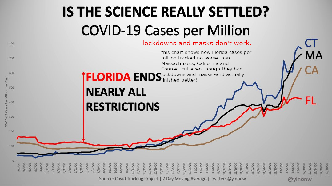
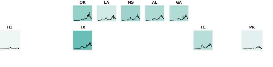
FLORIDA ENDS NEARLY ALL
RESTRICTIONS BUT FARES NO WORSE THAN STATES THAT IMPOSE MORE AND IN
FACT FINISHES IN A MUCH BETTER POSITION:
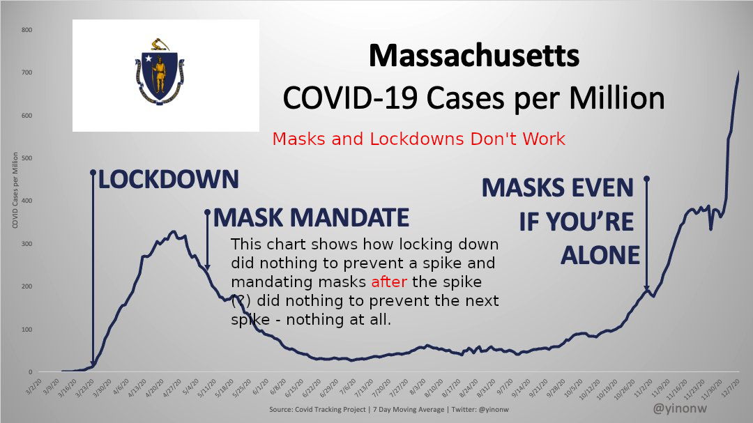
MASSACHUSETTS SHOWS HOW
RIDICULOUS IT ALL IS, ALL BY ITSELF: A STUDY IN PROFLIGACY
WITH PUBLIC FUNDS, DISREGARD OF EVIDENCE AND CONTEMPT FOR THE PUBLIC:
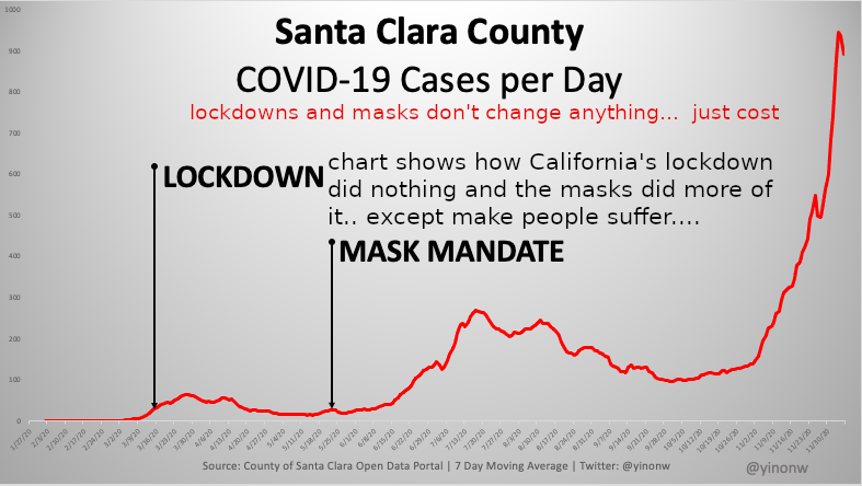
SANTA CLARA DEMONSTRATES HOW
MASKS CAN SOAK UP PUBLIC MONEY, DESTROY NORMAL LIFE AND BUSINESS AND DO
NOTHING TO ALTER THE COURSE OF A VIRUS:
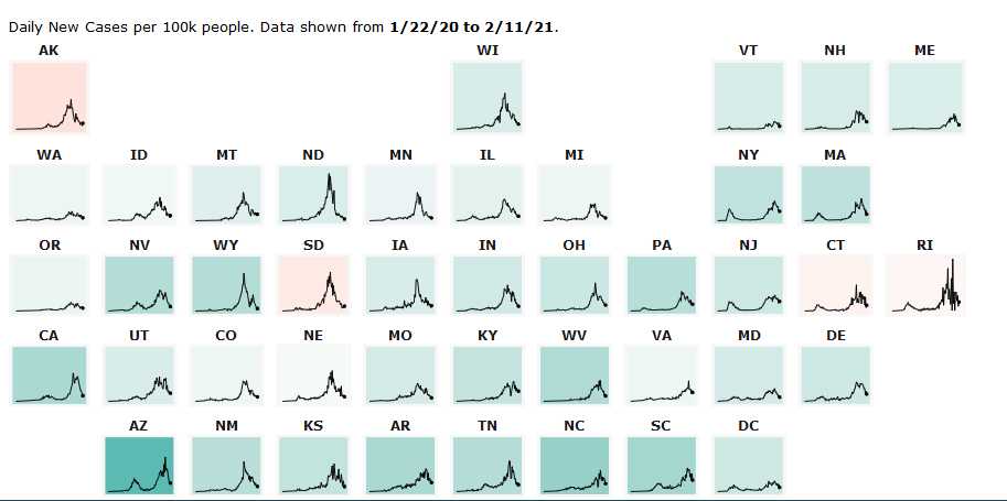
ALL 50 STATES SHOWING PEAKING AT THE SAME TIME, VIRTUALLY
IDENTICAL CURVES UP AND VIRTUALLY IDENTICAL CURVES DOWN REGARDLESS OF
MANY AND VARIED INTERVENTIONS AT DIFFERENT TIMES IN DIFFERENT
STATES: I.E. THE INTERVENTIONS MADE NO DIFFERENCE TO THE
VIRUS.
But made millions of dollars difference to people and their hopes and
plans and daily lives.
These charts can be viewed one state at a time, blown up large,
minutely inspected, simply go to John Hopkins University page: John
Hopkins 50 States Charts